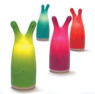
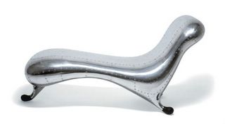
Today, we visited the San Jose Museum of Art to check out the Blobjects & Beyond: The New Fluidity in Design exhibit before it is removed early next month. The exhibit was really fascinating, and I truly enjoyed it. I was exposed to a plethora of fluidically designed objects such as these shown here.


Some Blobjects
It was a visual experience that really gave a glimpse of our future. It seems that everything these days is moving away from an angular design to one that is more fluidic. This exhibit really heightens your sensitivity to this trend, which has been ongoing for quite a number of years. Some common household items also have been affected by this blobject movement. One in particular is the toothbrush, which has gone from a tool with hard angles to one much more curvaceous. Another interesting blobject on display was a Ty Nant water bottle. There isn't much else that embodies the idea of the blobject better than this simple water bottle.

Ty Nant Water Bottle
Of course there were other exhibits at the museum. While they were also fascinating, they did not hold my interest nor open my mind as much as the Blobject exhibition.
2 comments:
Definitely great to hang this weekend. I was especially fond of the realization that Heineken Dark tastes just like Negro Modelo but without the gold foil - a nice improvement.
As for the Blobjects - sounds like a great exhibit, and I'm really happy to see a well placed joeyoke as the title. However, I think I disagree with the notion that design is necessarily headed toward these more organic shapes. Here are two examples:
1. Apple. Take a look at the original iMac, and compare it to the iMac today. I think both of these are examples of great industrial design, for which Apple is acknowledged as a leader. But the newest iteration of the iMac is clearly more angular than the original, blob-like version.
2. Motorola. Compare their hottest phone today, the Razr, with their hottest phone 3-ish years ago, the v60. While I agree this isn't as cut-and-dry as the Apple case, the Razr is clearly more angular than the v60, and both are/were considered quite progressive deisgns for their time. If you look at more Motorola phones from a few years ago (which I can't remember the names for), the blobbyness is even more pronounced.
I admit that these are both consumer electronics examples, but there are others out there in automotive, fashion, etc... Where will design go next? I don't know, but it will be very interesting to follow the curvy/angular dichotomy.
I will have to agree with much of what you said. Your examples are great, by the way. Saying that our future would be blobby, was probably a bit presumptuous of me.
I do think that the curvy/angular trend is cyclical. We definitely see how designs over the years will go one way then the other and back again. The part that is less clear to me is whether or not the longer-term trend is towards a more curvy world.
Also, funny that you mention Apple. The Apple sound system with the rounded glass speakers and sub-woofer was one of the items in the Blobject exhibit.
And, Negro Modelo without the gold foil taste is truly refreshing.
Post a Comment